Event Registration Conversion: How to Lift Completed Sign-Ups

Event Registration Conversion: How to Lift Completed Sign-Ups
Event registration conversion is the share of people who land on your event page and finish registering. To raise it, measure it per traffic source, cut every form field you don’t need, make the page work on a phone, and remove surprises at checkout. Most lost registrations come from friction, not from lack of interest. That is good news, because friction is something you can fix this week. Jubiliq puts the event website, RSVP tracking, ticketing and progress dashboard in one place, so you can see the numbers and act on them without stitching tools together.
This guide is for people running a wedding, a client event, a fundraising gala, a golf outing or a big party. You don’t need a marketing team. You need a clear number, a short form and a few honest tests.
TL;DR
- Conversion rate = completed registrations ÷ page visitors × 100. Track it for each traffic source, not just overall.
- Long forms, forced account creation and surprise costs are the usual reasons people quit. Ask only what you need to run the day.
- A slow or awkward mobile page loses people before they read your offer.
- Change one thing at a time, and compare like with like before you decide it worked.
- Registration is only half the funnel. Reminders and a clear day-of plan turn sign-ups into guests who show up.
Table of Contents
- What event registration conversion actually measures
- Why people abandon registration forms
- Fix the form first
- Make the page work on a phone
- Give the page one clear job
- Use your channels to bring in the right visitors
- Test changes without fooling yourself
- After the click: turn registrations into attendees
- Where Jubiliq fits
- Our perspective
- FAQ
- Sources
What event registration conversion actually measures
Pick one definition and keep it. “Conversion” can mean three different things, and they are not interchangeable:
- Registration conversion: visitors who completed the form ÷ visitors who viewed the page.
- Paid conversion: visitors who completed payment ÷ visitors who viewed the page. This applies to ticketed events such as galas and golf outings.
- Attendance conversion: people who showed up ÷ valid registrations. This is a different question, about reminders and event-day appeal, not about your form.
The basic formula is simple. If 10,000 people visit your page and 500 register, your rate is 500 ÷ 10,000 × 100 = 5%. A low rate usually points at the page: unclear value, a clumsy form or a broken mobile layout. A high rate says your message matches your audience.
Small events need a caution here. A wedding website with 80 visitors and 60 RSVPs is a 75% rate, because the audience is people you invited by name. A public fundraiser promoted on social media will see far lower numbers. Never compare your rate to someone else’s unless the audience and the definition match. Compare your own rate week to week instead.
Split the number by source
One blended rate hides the truth. Visitors from your invitation email, your Instagram post and a partner’s newsletter behave very differently. Track each source on its own so you can see which one sends people who actually finish. If the email list converts at 20% and social at 2%, the answer isn’t to fix the form first. It’s to put more effort into the email list and look at what the social landing message promises.

If you use Jubiliq, the real-time progress dashboard shows registrations as they come in, and segment email blasts let you send a message to one group and compare the response against another.
Why people abandon registration forms

People rarely leave because they stopped caring. They leave because finishing got harder than they expected. Forbes reported in July 2026 that personal information steps cause the most drop-offs in registration flows, and cited Expedia earning an extra $12 million by deleting a single form field.
The e-commerce research on checkout points the same way. The Baymard Institute’s cart abandonment statistics show that 17% of US online shoppers abandoned an order because checkout was too long or complicated, and 18% because the site wanted them to create an account. The top reason, at 40%, was extra costs that were too high, such as fees and taxes. Ticket buyers are shoppers too, so the lessons carry over:
- Too many questions. Every field is a small decision and a small chance to quit.
- Forced accounts. A guest who just wants to say yes to a party will not create a password.
- Surprise fees. A price that jumps at the last step feels like a trick.
- Errors and slow pages. A form that crashes, or rejects a phone number for an invisible reason, ends the attempt.
- Doubt about safety. A payment page that looks unfamiliar or unfinished makes people hesitate.
Fix the form first
The form is where conversion is won or lost, so start there. Our own guide to event registration flow, steps, fields and fixes goes deeper, but the core moves are these.
Ask only what you need to run the day
For each field, ask: what will I do with this answer, and when? If you can’t name a decision it feeds, delete it. A practical split:
| Event | Must ask | Ask later (after they register) |
|---|---|---|
| Wedding | Name, attending yes/no, party size | Meal choice, song requests, address for thank-you cards |
| Corporate client event | Name, work email, company | Job title, dietary needs, session choices |
| Fundraising gala | Name, email, number of seats, payment | Table preferences, guest names, auction interests |
| Golf outing | Name, email, team or single entry, payment | Shirt size, handicap, cart sharing |
| Large party | Name, attending, headcount | Dietary needs, plus-one details |
The right-hand column isn’t dropped. It moves to a follow-up message once the person has committed, when they are far more willing to answer. For ideas on which questions protect your event day, see our list of registration questions worth asking.
Make each field obvious and easy
Forbes recommends removing non-essential fields, explaining why each is needed, and starting with easy questions. It also suggests better autofill, pre-filling for returning users and resume links so someone who stops halfway can pick up where they left off. The same piece describes a multi-step enquiry form that revealed a few fields at a time and lifted conversions from 0.96% to 8.1%, with no change to traffic, offer or copy. That is one company’s result, not a promise, but it shows how much form design alone can matter.
Short checklist for your form:
- Put the easiest question first, usually name.
- Label every field in plain words. “Number attending, including you” beats “Party size.”
- Allow guest checkout. Don’t ask people to create an account.
- Use the right keyboard type on phones: numeric for phone numbers, email for addresses.
- Show errors next to the field that caused them, in words a guest understands.
Show the full price early
For paid events, state the ticket price, what it includes and any fees on the event page, before the checkout step. Baymard’s top abandonment reason is unexpected extra cost. If you offer more than one price, a clear tier layout helps people choose quickly; our guide to event ticket tiers covers how to set them up.
Make the page work on a phone
Most of your guests will first open your link on a phone, often from a text message or social post. If the page is slow or the button is hard to tap, they leave before they see your form.
Speed matters in measurable ways. A Think with Google study found that as mobile page load time goes from one second to three seconds, the probability of a visitor bouncing increases by 32%, and from one to five seconds, by 90%. Keep your page light: a few compressed images, no autoplay video, no giant banner files.
A mobile checklist:
- The date, place and price are visible without scrolling much.
- The register button is large and stays easy to reach.
- Text is readable without zooming.
- Form fields are wide enough to tap without hitting the wrong one.
- Payment works with a phone wallet or saved card details where possible.
Our mobile event registration setup guide walks through this in more detail.
Give the page one clear job
A registration page should answer four questions in seconds: what is it, when and where, what does it cost, and what do I do next. Put those at the top, with one obvious button. Everything else, such as the schedule, the story behind your cause or the hotel block, can sit below for people who want it.
Design and presentation shape trust too. If you’re running a corporate event and want the page and the experience to feel polished on a modest budget, these ways to make a corporate event feel premium show how small touches in decor and presentation add up, and the same thinking applies to how your page looks.
Trust cues that help without clutter:
- A named host or organization, so people know who is asking.
- A plain statement of refund or transfer terms for paid tickets.
- A contact email for questions.
- Clean, consistent branding from the invitation to the page.
If you collect guest data from people in Europe or need an accessible page, the legal basics matter too. Our piece on event website essentials backed by GDPR and WCAG lists the pages and features to include.
Use your channels to bring in the right visitors
Conversion depends on who arrives. A page that converts 20% for a warm email list may convert 2% for cold social traffic. So the message that sends people to the page should match what they find there.
- Invitation emails: one link, one action. Send to segments, such as past donors, current sponsors or the bride’s side of the family, with wording that suits each.
- Social posts: lead with the reason to come, then the link. Don’t make people hunt for the date.
- Partners and sponsors: give them a short blurb and a link they can drop into their own newsletters, so you can see what their audience delivers.
- Group buyers: if companies or teams may buy several tickets, explain how that works. See our note on group ticket discounts.
If you want a full picture of selling paid tickets, from setup to promotion, read our practical guide to selling event tickets online.
Test changes without fooling yourself
You don’t need a lab. You need discipline.
- Write down your baseline. Record your rate by source for at least a week or two before touching anything.
- Change one thing. Shorten the form, or rewrite the headline, or move the price. Not all three.
- Wait for enough traffic. A rate based on 12 visitors is noise. Let the numbers build before you judge.
- Compare like with like. Compare the same source, over a similar period, with the same definition of conversion. A newsletter blast to your best fans will always beat a cold post.
- Keep what works. If the rate rises and stays up, keep the change. If not, undo it and try the next idea.
Watch for a trap: a higher registration rate isn’t a win if fewer registered people show up or pay. Check the full chain, visitors to registrants to attendees, before you declare victory.
After the click: turn registrations into attendees
A completed registration isn’t a guest in a seat. People forget, plans change and a reminder is often all it takes. Count your attendance conversion as people who showed up ÷ valid registrations, and exclude cancellations from the denominator so they aren’t mistaken for no-shows. To measure this you need a check-in record, not just a sign-up list.
Send reminders in a rhythm: a first note one to two weeks out, a second a few days before, with practical details such as parking, schedule and what to bring. We lay out sample wording in 6 RSVP reminder emails.
Where Jubiliq fits
If you run a free event, such as a wedding, a party or any event in planning-only mode, Jubiliq costs nothing. The Starter plan is $0 per event. If you sell tickets, take sponsorships or collect donations, the Organizer plan charges 2% per paid registration plus Stripe fees, so you pay when you actually get paid. Larger organizations running many events can talk to us about the Enterprise plan, which has no published price.
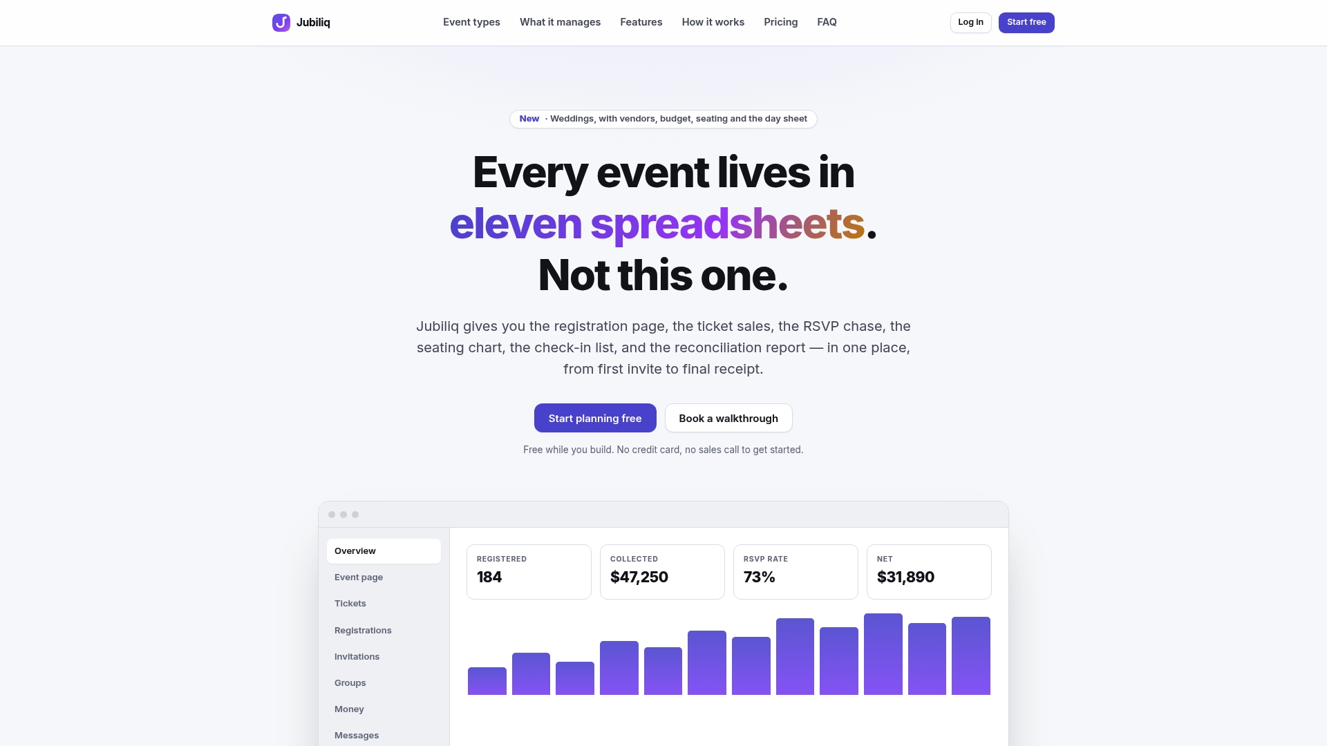
One platform covers the guest list with RSVP tracking, event website publishing, ticket and sponsorship sales, donation handling, segment email blasts, a real-time progress dashboard and CSV export for your accounts. Because the planning interface adapts to your event type, a golf outing sees golf tools and a wedding doesn’t. You can start on Jubiliq and publish your event page the same day you set up the guest list.
Our perspective
Most organizers treat registration as a form to build once and forget. We see it as the first live test of your whole event plan.
When the guest list, the budget, the ticket price and the day sheet live in separate places, every change means updating four things, and the registration page is the one that goes stale. That is why our platform keeps everything in one workspace, from invite to day-of coordination, with real-time updates on who has registered.
We also believe the tools should fit the event. A bride on a budget doesn’t need sponsorship packages, and a gala committee doesn’t need a meal-choice grid for 40 guests. Our adaptive interface hides what’s irrelevant, so the page you publish asks for what matters and nothing more. Fewer questions and fewer screens are what a higher conversion rate looks like in practice.
HCRF
FAQ
What is a good event registration conversion rate?
It depends on your audience and your definition. A private wedding or party site, where everyone is invited by name, can reach very high rates. A public ticketed event promoted to strangers will convert far lower. Measure your own rate by source, then aim to beat it with each change.
How do I calculate event registration conversion?
Divide the number of completed registrations by the number of page visitors, then multiply by 100. For example, 500 registrations from 10,000 visitors is 5%. For paid events, count completed payments instead of completed forms, and keep the same definition each time.
How many fields should a registration form have?
As few as it takes to run the event. Name, email and headcount are enough for many events, plus payment for ticketed ones. Collect extras such as meal choices or shirt sizes in a follow-up message after the person has registered.
Does requiring an account hurt registration?
Yes, it adds friction. Baymard’s research found that 18% of US online shoppers abandoned an order because the site wanted them to create an account. Let guests register with just their name and email.
How do I reduce form abandonment on my event page?
Shorten the form, show the full price early, make the page fast on a phone and show errors clearly. Then change one thing at a time and watch your rate by traffic source to see what helped.
Sources
- Not Enough Event Registrations? Start With Your Registration Form, Forbes
- Cart Abandonment Rate: 50 Statistics and Why People Abandon, Baymard Institute
- Milliseconds Make Millions, Think with Google