Seven Event Dashboard Metrics Organizers Can Map to ROO, ROI, and ROP

Seven Event Dashboard Metrics Organizers Can Map to ROO, ROI, and ROP
Every event dashboard needs seven metric groups: registrations and attendance, engagement, revenue and ROI, marketing and acquisition, sponsors and exhibitors, operations, and post-event feedback. The strongest dashboards narrow this down to a core handful of KPIs mapped to specific goals, mixing in a small number of leading indicators so teams can correct course mid-event rather than only learning what happened after the fact.
TL;DR:
- Registration pace and check-in rates are early indicators for adjusting marketing efforts before event completion.
- Engagement metrics like dwell time and resource downloads reveal attendee interest beyond just attendance numbers.
- Post-event revenue and ROI calculations should use multi-month attribution to account for delayed purchasing or donation processes.
- Real-time operational metrics, such as wait times and incident logs, must be displayed on separate dashboards for frontline decision-making.
- Tracking sponsor leads, attendee satisfaction scores, and sentiment feedback are essential for renewal and improvement prospects.
Table of Contents
- How to Structure Your Dashboard Across KPI Tiers
- Registration and Attendance Metrics to Track
- Engagement Metrics: Sessions, Content, and Connections
- Revenue and ROI Metrics to Display
- Marketing and Acquisition Metrics to Include
- Operations and Logistics Metrics for Day-Of Decisions
- Sponsors and Exhibitors Metrics to Report
- Post-Event Feedback and Sentiment Metrics
- Dashboard Design and Visualization Best Practices
- Building Your KPI Playbook and Measurement Cadence
- Applying These Metrics With Jubiliq
- How Metric Priorities Shift by Event Type
- Put This Playbook to Work With Jubiliq
- FAQ
- Sources
How to Structure Your Dashboard Across KPI Tiers
A dashboard works when it separates top-line KPIs from the drilldown metrics that explain them. Executives want a snapshot: revenue, attendance, and return metrics. Marketing teams want channel performance and conversion funnels. Operations teams need real-time counts and alerts.
- Executive view: 5 to 6 headline KPIs, trend lines, and benchmarks against past events.
- Marketing view: channel-level conversion, registration pace, cost per acquisition.
- Operations console: live check-in counts, capacity alerts, incident logs.
Real-time indicators belong on the operations console; exports and detailed reports sit one click below every view, not buried in a separate tool.
Registration and Attendance Metrics to Track
Registration numbers tell you how demand is tracking, but pace against target is what lets you act before it is too late. Watch registration pace relative to goal, check-in rate on event day, ticket-type breakdown, and attendee no-shows.
- Registrations and pace: cumulative sign-ups plotted against a target curve.
- Check-in rate: the share of registered attendees who actually arrive.
- Ticket-type breakdown: VIP, general, sponsor, and comp tickets tracked separately.
- No-shows: a signal for future capacity planning and marketing spend.
Leading indicators like registration pace allow mid-event course correction, according to PCMA’s conference metrics guidance, which treats attendance and attendance loyalty as primary signals worth watching before the event concludes rather than only afterward. When pace slips behind target, that is the trigger for a pricing adjustment or a push through an underperforming channel. Segmenting by attendee type also lets your team route VIP and sponsor follow-up differently than general attendee follow-up.
Engagement Metrics: Sessions, Content, and Connections
Attendance alone does not tell you whether people cared. Session fill rate, dwell time, poll and Q&A participation, and resource downloads reveal whether content landed.
- Session attendance and fill rate: which topics pulled a crowd and which emptied out.
- Dwell time: how long attendees stayed engaged rather than stepping out.
- Poll, Q&A, and resource engagement: direct signals of attention and interest.
- Network interactions: meetings scheduled, messages exchanged, and meetings that converted into sales leads.
Normalizing engagement per attendee is the only way to compare a 200-person event against a 2,000-person one on equal footing, since raw counts naturally favor larger gatherings regardless of how engaged each attendee actually was.
Pro Tip: Track meetings converted to leads separately from meetings scheduled, since a high meeting count with low conversion points to a networking format issue rather than a demand problem.
Revenue and ROI Metrics to Display
Financial metrics are what justify the next event’s budget. Show ticket revenue, sponsorship and exhibit revenue, attributable pipeline and deals, cost per attendee, and cost per acquisition (CPA) side by side.
- Ticket and sponsorship revenue: the direct income lines, tracked separately.
- Attributable pipeline: deals or donations your team can trace back to event attendance.
- Cost per attendee and CPA: total spend divided by attendees or by acquired leads.
A basic ROI formula, net event profit divided by total event cost, gives stakeholders a number to benchmark across events. But proving event ROI often requires multi-month attribution rather than same-week conversion tracking, since buying cycles rarely close inside the event window itself. Set a standard attribution window, document it once, and apply it consistently so every event’s ROI is measured the same way.
Marketing and Acquisition Metrics to Include
Marketing metrics show which channels actually filled the room, not just which ones looked busy. Track traffic sources and UTM-tagged campaigns, registration conversion rate by channel, email open and click rates, and leads generated by source.
- Channel-level conversion: registrations divided by clicks or visits, by source.
- Email performance: open and click-through rates tied to specific sends.
- Leads by source: which channel produced leads your sales team can act on.
Early in the funnel, treat these as demand generation signals rather than expecting immediate ticket sales from every channel. A conversion funnel visualization, from impression to click to registration, makes it obvious where a channel is losing people, which is far more useful than a single blended conversion rate.
Operations and Logistics Metrics for Day-Of Decisions
Operational metrics are the ones your frontline team needs in real time, not in a weekly report.
- Check-in throughput and wait times: flags bottlenecks before a line forms out the door.
- Incident counts: tracked by category so recurring problems get fixed, not just patched.
- AV and technical uptime: especially critical for hybrid or livestreamed sessions.
- Staffing ratios: attendees per staff member, by zone, to catch understaffing early.
- Capacity utilization: session-level over or undersubscription alerts so you can redirect foot traffic.
These metrics belong on a live, auto-refreshing screen for ops staff, separate from the executive dashboard, since the two audiences need different update speeds and different levels of detail.
Sponsors and Exhibitors Metrics to Report
Sponsors renew when they can see what they got. Report booth visits, leads captured per exhibitor, qualified meeting counts, and sponsor-attributable revenue.
- Booth visits and leads captured: raw traffic plus the leads that actually got scanned or submitted.
- Qualified meeting counts: meetings that met a defined criteria, not just any conversation.
- Sponsor-attributable revenue: deals your team can trace to a specific sponsor’s leads.
Retention and renewal rates, along with a simple exhibitor satisfaction score, round out the picture. The most common failure point here is inconsistent lead definitions between exhibitors, so standardize what counts as a “lead” before the event, not after.
Post-Event Feedback and Sentiment Metrics
Numbers tell you what happened; sentiment tells you why. Track Net Promoter Score (NPS), survey response rate, session-level ratings, and sentiment tagging from open-text feedback.
- NPS and satisfaction scores: the standard loyalty and advocacy signal.
- Survey response rate: low response rates weaken confidence in every other feedback number.
- Session ratings: granular enough to flag which specific content underperformed.
Return on Participation (ROP), one of the lenses in PCMA’s ROE measurement framework, links behavioral engagement to attitudinal outcomes like loyalty and advocacy rather than treating them as separate reports. Combining attitudinal and behavioral data gives a fuller read on event impact than either dataset alone.
Dashboard Design and Visualization Best Practices
A dashboard that takes much longer than a few seconds to interpret is less effective. Apply a quick-glance rule: your top core KPIs should be readable almost immediately, with color reserved for alerts and status, not decoration.
- Trend lines and benchmarks: show this event against the last three, not just a single static number.
- Audience-specific layouts: executives, marketing, and operations each get a tailored view.
- Ratios over raw counts: engagement per attendee beats a raw engagement total every time.
- Automated anomaly alerts: flag a metric that drifts outside its normal range without waiting for someone to notice.
Pro Tip: Put the export button somewhere obvious. A dashboard that requires three clicks to download a CSV gets screenshotted and misquoted instead.
Building Your KPI Playbook and Measurement Cadence
Map every candidate metric to one of three lenses: Return on Objective (ROO), Return on Investment (ROI), or Return on Participation (ROP). This filters out vanity metrics fast.
- Choose 5 to 6 core KPIs, including 1 to 2 leading indicators like registration pace or early engagement.
- Set cadence: real-time for day-of operations, weekly for marketing and sales checks, and post-event plus multi-month follow-up for revenue attribution.
- Assign an owner and a written definition to each KPI so two teams never report different numbers for the same metric.
PCMA and CEMA’s KPI playbook guidance recommends exactly this: a short document naming each KPI, its data source, owner, reporting frequency, and acceptable benchmark range.
| Cadence | Who checks it | Example metric |
|---|---|---|
| Real-time | Operations staff | Check-in throughput, capacity alerts |
| Weekly | Marketing and sales | Channel conversion, registration pace |
| Post-event | Leadership | NPS, revenue, ROI |
| Multi-month | Revenue/sales ops | Attributable pipeline, closed deals |
Applying These Metrics With Jubiliq
We built our event planning platform around these exact groups: RSVP and ticketing data feed registration metrics, schedule tools feed engagement tracking, and built-in financial tracking covers revenue and ROI. A printable day sheet and CSV export provide data access for staff who need it on paper.

How Metric Priorities Shift by Event Type
Commercial metrics matter more as event size and budget grow. A wedding should prioritize experience: RSVP accuracy and guest satisfaction over revenue. A corporate conference should balance engagement with pipeline. A fundraiser lives or dies on donation totals and donor retention.
— HCRF
Put This Playbook to Work With Jubiliq
Our platform includes RSVP and ticketing data, real-time day-of dashboards, financial tracking, and one-click exports all in one place.
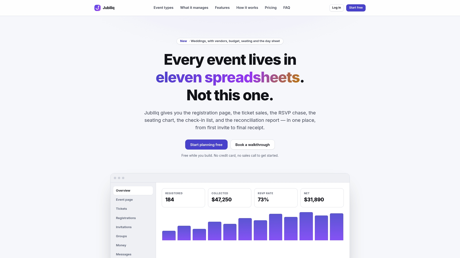
- Starter: a free plan suitable for certain event types.
- Organizer: a paid plan with fees based on registration transactions.
- Enterprise: custom pricing for larger or multi-event organizations.
Check plans and features to see which fits your next event, or start building your dashboard directly on the platform.
FAQ
What are metrics in a dashboard?
Metrics in a dashboard are the specific, measurable data points, like registrations, revenue, or session attendance, displayed visually so a team can track performance at a glance. A well-built dashboard limits itself to the metrics tied to a stated goal rather than showing every number available.
What are KPIs for events?
Event KPIs are the small set of metrics chosen to judge success against a specific objective, typically 5 to 6 core indicators according to PCMA and CEMA’s playbook guidance. Common examples include registration pace, attendance rate, revenue, ROI, and NPS.
What are the 5 C’s of an event?
Definitions of the “5 C’s” vary across the events industry and no single authoritative source ties the term to a fixed list. Rather than relying on an unverified framework, most practitioners find it more useful to measure against the ROO, ROI, and ROP lenses outlined in PCMA’s ROE framework.
What is the 5 second rule for dashboards?
The 5-second rule holds that a dashboard’s most important KPIs should be understandable within about five seconds of looking at the screen. That means limiting the top-level view to a handful of headline numbers and pushing supporting detail into drilldowns rather than cluttering the main view.